Film & TV Language: Film poster analysis
Film & TV Language: Film poster analysis

ENIGMA CODE- is used as we are unaware where the protagonist is looking.
PROTAGONIST- the hero is positioned in the centre of the frame.
ANTAGONIST- seems to be the woman whose got serious FACIAL EXPRESSIONS and mirrors FEMME FATALE.
HYBRID GENRE - action (identified from the PROPS shown eg gun) and sci-fi (identified from the background setting eg stars)
HIGH ANGLE- focus on the character
TAGLINE- quote added from the movie
TARGET AUDIENCE- young adults
LIGHTING- focused on the protagonist to bring more attention
GENRE- action
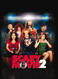
HYBRID- genre of comedy and horror
COLOURS- multiple colours help differentiate the film as comedy-horror.
BACKGROUND-horror elements like haunted house themes
TAGLINE-comedic language used to show the film as parody
FACIAL EXPRESSIONS- exaggerated, goofy expressions contrasting serious, terrified actions
HIGH KEY LIGHTING- brighter lighting to emphasise comedy
REVIEW- catching opion of others about the movie
AUDIENCE- young adults
GENRE- comedy-horror

COLOURS- desaturated colours evoking sense of melancholy
WIDE SHOTS- character framed against large landscape (isolation)
BODY LANGUAGE- stillness of body language- theme of isolation
TYPOGRAPHY- simple and straight-forward
SETTING- realistic setting - immerses the audience as it may link to reality
MOOD- melancholic mood
GENRE-ART HOUSE
TARGET AUDIENCE- international film audience

COLOURS- contrasting colours - innocence vs fear/darkness
LIGHTING- the sunlight perhaps is symbolic of safety
CENTRAL FIGURE- the boy is positioned in the centre, making him the protagonist.
ENIGMA- we are unaware as to where the boy is looking
CRITICS COMMENT- gives opinion of others
TYPOGRAPHY- bold font - clarity, bravery
HIGH ANGLE SHOTS- the boy is looking down the hole
GENRE- psychological thriller/ coming of age
TARGET AUDIENCE- young adults
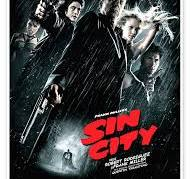
COLOURS- monochromatic colours- dramatic effect, noir aesthetics, shadows, danger
SILHOUTTE- add ambiguity and secrecy
TYPOGRAPHY- bold to evoke violence and rebellion perhaps
CLOSE-UPS- faces and body positioning of main characters, showing their emotions
EXPRESSIONS- dramatic expressions as they are exaggerated
PROPS- displayed props like weapons- violence as central theme
MOTIF- of blood in the title and through props eg gun
GENRE-action
TARGET AUDIENCE- mature audience due to violence

POSES- heroic poses of characters with confidence
PROPS- such as pistol in hands of the main characters
GENRE- action
FONT- bold, reflecting adventureous tone
DYNAMIC MOVEMENT- eg : flowing of hair- wind, adventure.
SETTING- stormy sky highlights turbulence, sense of danger.
IMAGERY- of weather
MISE EN SCENE- weapons, setting, skull, highlighting danger.
TARGET AUDIENCE- family audience

POSITION- main characters are positioned in the centre of the frame- shows thier importance.
BACKGROUND- with supporting actors
FACIAL EXPRESSIONS-shows a elated mood
TYPOGRAPHY- elegant font that appears classic
CRITICS COMMENT- given opinion about the movie
PROTAGONISTS- can be identifed as they are clearly visible
LIGHTING- soft, natural lighting, romantic/nostalgic mood
GENRE- rom-com
TARGET AUDIENCE- younger audience

MONOCHROMATIC COLOUR- desaturated colour scheme (struggles perhaps)
HIGH CONTRAST LIGHTING- contrast between light and shadow (conflict)
POSITIONING- side profile of character perhaps shows duality or mystery
FACIAL EXPRESSION- serious looks on the faces of the characters
BACKGROUND AND FOREGROUND- contrast as background characters are slightly faded.
TYPGORAPHY- bold, simple title.
TAGLINE- powerful, short phrases
TARGET AUDIENCE- adults, fans of boxing
GENRE- sport drama
Comments
Post a Comment